Why don’t UI Designers contribute to Open-Source software, and why is it often so ugly?
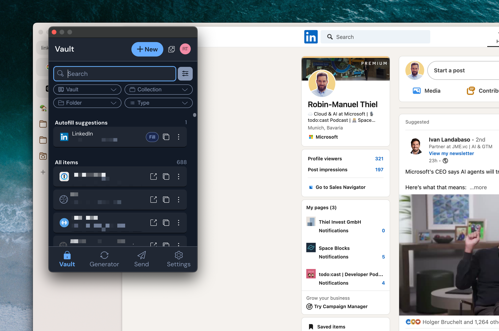
Bitwarden, the password manager I use, announced a visual redesign. As one of the least aesthetic apps I rely on, I was eager to see the update. Sadly, my excitement turned to disappointment—it still feels like a hackathon project with noticeable UI quirks. Why is that?

A few days ago, Bitwarden, the password manager I use, announced a major visual redesign. As one of the least aesthetic apps I rely on, I was eager to see the improvements. Unfortunately, my excitement turned into disappointment when I opened the updated app—it still feels like a hackathon project, with noticeable UI quirks. So, why is that?
First, let me be clear: no finger-pointing intended here. The Bitwarden team does a fantastic job delivering a reliable, open-source, and transparent password manager that I trust completely. That’s why it’s even more frustrating to see such a lack of polished design.
This isn’t just a Bitwarden issue; it’s a common pattern in open-source software. Many projects, like most Linux distros, struggle with unattractive interfaces, which, I believe, is a major barrier to mainstream adoption. A design update in late 2024 shouldn’t feel like an early Android app from 2010—but here we are.
I can’t help but think that many potential users might skip products like Bitwarden because of their uninspired design. As someone who values both function and aesthetics, I find this hard to ignore—and I doubt I’m alone.
So, the question remains: Why is that? Don't UI Designers contribute to open-source projects? I can imagine, it's harder to contribute entire end-to-end design concepts than small code changes here and there. How can we change that?
To make this article also constructive, I've collected the UI quirks, that I spotted in the updated app and would love to see addressed:
- The Profile button has a white border when hovering it. All other buttons have a blue one
- The Fill button looks like a tag or label, not like a clickable button because it looks different from all other buttons
- The Search Bar is larger (in height) than the Filter button right next to it. This is especially noticeable when the filter menu is opened.
- All buttons in the title bar have different heights (New, Pop Out, Profile)
- The Scroll Bar in the Vault view isn't using the full view height and (even worse) leaves the items misaligned (not centered) on systems where it's always visible
- The Filter Dropdown Menu Buttons have a different border radius than the Search Bar and the menus that open when clicking on the filters.
- There is no bottom padding when scrolling down to the bottom in the Generator view
- The bottom navigation feels like a weird design choice for a browser extension and is an outdated pattern in general
- The Search Bar is way too big and prominent, given that in 99% of the cases I just click the first autofill suggestion
- The icon buttons have a square outline when hovered, which looks weird. I would have expected a round one or no outline at all
- Different icons and fonts than in the Mobile and Desktop Apps
